 +380 95 865 80 88
 +386 51 788 878
Brand book TourSlo
Logo, colours, fonts, buttons and photos — so that the website, social media, van stickers and messages to clients all look like one company.
Logo
A minibus with a board on the roof and the word TourSlo. The mark is drawn in lines, with no website address: the address goes on a separate line.
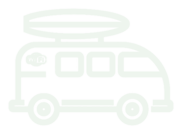 TourSloTourSlo

- Clear spaceat least the height of the mark’s wheel — nothing is placed within that space on any side.
- Minimum size40 px mark width on screen, 12 mm in print — any smaller and the lines run together.
- Mark colourwhite on graphite or on a darkened photo, graphite on light backgrounds. No other colours.
- Don’t stretch itor squash it — resize only in proportion.
- Don’t add the addressof the website or phone numbers to the mark itself.
- Don’t place it on a busy photowithout a dark backing — the mark gets lost.
Colours
A white page, light grey bands, graphite for the header and one dark band. Neon is only an accent: the main button, “Prices” in the header, selected items.
- Neon
#5BEA3EMain button, selected items, “our” object. Not for text on white. - Graphite
#1F232BHeader, footer, one dark band per page. - Text
#1E212AHeadings and body text. - Secondary
#5C6270Notes and captions. - Mist
#F5F6F8Background of the alternating light sections. - Line
#E3E6EBThin list dividers and card borders. - Dark green
#25661B“Included” ticks, arrows on action links. - Error
#B42318Error messages only.
Proportion: in the interface without photos — no more than 3% green, and 0.3–2% neon.
Fonts
Three fonts, each with its own job. All of them cover Cyrillic and Latin and are hosted on our own server.
Uzhhorod — Ljubljana
Headings, large prices, route names.We pick you up and drop you off at your addresses. Payment — in full, by card online.
Text, buttons, form fields.12:00 · TS-2026-0000 · +386 51 788 878
Times, parcel numbers, phone numbers, labels.Buttons, icons and the TourCoin
One main button per screen — neon. The second one — underlined text. The label is the client’s verb: “Get a price”, “Send a parcel”.
Outline style, 2 px line, 24 px. One set for the whole site — images/icons.svg. No emoji in place of icons.
The bonus programme coin: the value “1” on one side, the mark on the other. Graphite with a neon rim. About TourCoins
Photos
Real places and our own vehicles: daylight, natural colours, a level horizon. No night shots, grey skies or scaffolding.
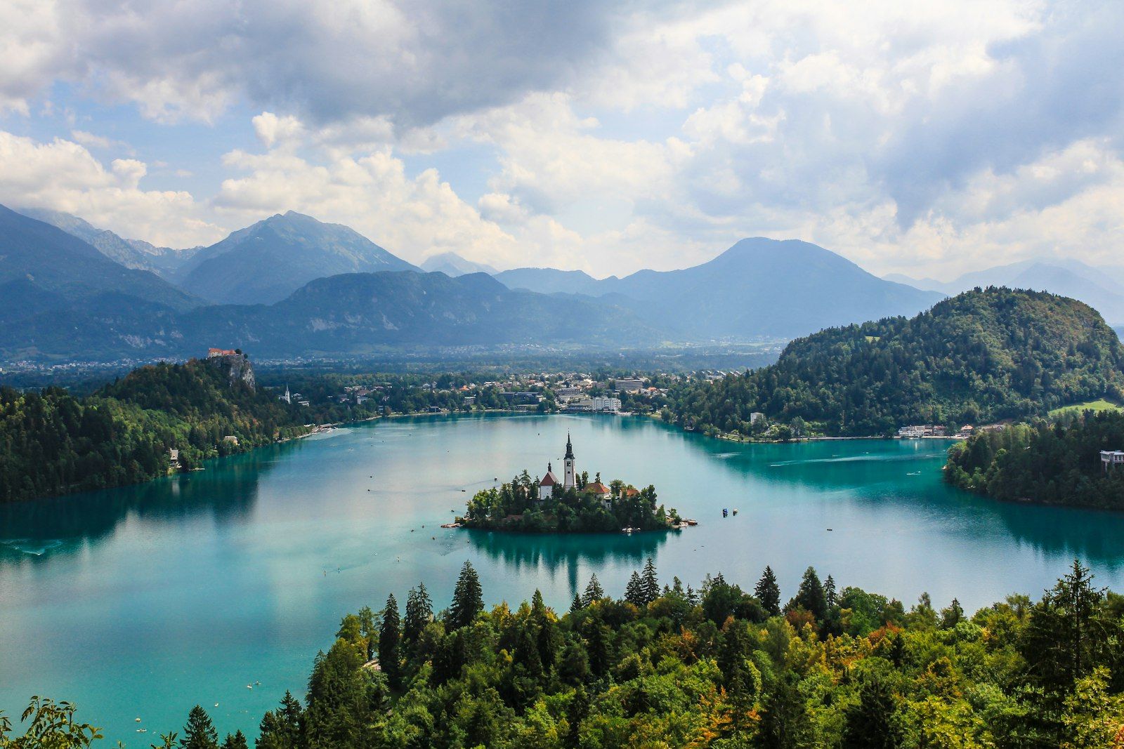

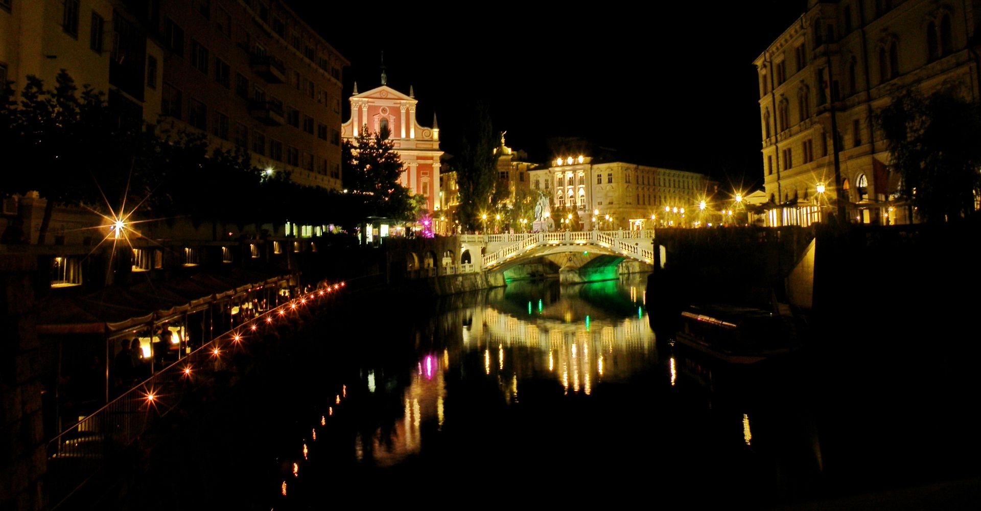
AI illustrations — only without real people, places or brands, and we list them on the “Photo credits” page. City photos on the site are real photographs.
How we write
- Business-like and simplepolite, short and factual, addressing the reader formally. Fact first, then explanation; one thought — one sentence; one service — one name. A heading says what is in the block; a button names the customer’s action. No “well”, “just”, “we do it all ourselves”, no jokes, exclamations or officialese (“we provide”, “the said”).
- Numbers come from the price listprices, days and times come from one place; we never write “from” at random.
- Verifiable onlyno “best”, “No. 1”, “always”, “guaranteed” or made-up reviews; reviews are only real ones from Google.
- SloganTourSlo — precise, fast, reliable.